
Build a modal component with a powerful React hook
PS: This article is aimed at intermediate-level devs. If you're a beginner, you're more than welcome to read on, but don't get discouraged by the things you may not understand, just add them to your learning list, and come back any time.
Ok, let's get right into it.
Let's talk about the requirements
The initial requirements are simple: I want to be able to click a button, a modal opens, read some content/do some action, and then close the modal.
Also, I like my UI components to be accessible, so the first thing I do when I'm building a component is head to the "ARIA Authoring Practices Guide". What we're going to build today is the "Dialog (Modal)" component.
In general, there are a couple of things to consider when building accessible components, keyboard interactions, focus management, and the WAI-ARIA roles, states, and properties. So let's keep those in mind as we progress through.
The environment
If you'd like to code along, you can follow these steps to set up a React environment
The basics
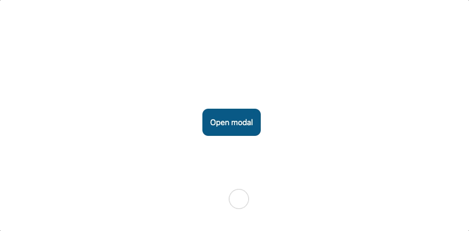
let's start with the basics: A button, a modal, some action, and a close button. Here's what that looks like:

Here's what the code looks like:
// App.js
import { useState } from "react";

export function App() {
  const [isOpen, setIsOpen] = useState(false);
  const [count, setCount] = useState(0);
  const openModal = () => {
    setIsOpen(true);
  };
  const closeModal = () => {
    setIsOpen(false);
  };
  const modalClickHandler = (event) => {
    event.stopPropagation();
  };
  const countUp = () => {
    setCount(count + 1);
  };

  return (
    <div className="flex justify-center h-screen items-center">
      <button
        className="bg-sky-800 text-white p-4 rounded-xl hover:bg-sky-600"
        onClick={openModal}
      >
        Open modal
      </button>
      {isOpen && (
        <div
          className="flex items-center justify-center fixed top-0 right-0 bottom-0 left-0 bg-[rgba(0,0,0,0.8)] z-10"
          onClick={closeModal}
        >
          <div
            role="dialog"
            id="modal"
            aria-labelledby="modal_label"
            aria-modal="true"
            className="border border-neutral-100 rounded-xl w-full max-w-md bg-white shadow-lg"
            onClick={modalClickHandler}
          >
            <header className="border-b border-neutral-200 px-6 py-6">
              <h2 id="modal_label" className="font-semibold text-center">
                Modal
              </h2>
            </header>
            <div className="px-6 py-6 text-neutral-600">
              <p>Counter: {count}</p>
            </div>
            <footer className="flex justify-end gap-4 px-6 pb-6">
              <button
                type="button"
                className="bg-sky-200 hover:bg-sky-300 active:bg-sky-400 px-4 py-2 rounded-lg"
                onClick={countUp}
              >
                Count up!
              </button>
              <button
                type="button"
                className="bg-neutral-200 hover:bg-neutral-300 active:bg-neutral-400 px-4 py-2 rounded-lg"
                onClick={closeModal}
              >
                Close
              </button>
            </footer>
          </div>
        </div>
      )}
    </div>
  );
}
We'll take care of keyboard interactions and focus management in the following sections.
Notice how we have the modal logic mixed with other logic, for example, the isOpen state and the openModal, closeModal, modalClickHandler functions are mixed with the count state and the countUp function. Wouldn't it be better if we separated them? Let's do that next.
Turning it into a hook
React custom hooks are a powerful way of encapsulating logic and making it reusable. In this section, we will use a couple of React patterns that help us build a powerful custom hook.
useModal
Our goal is to separate the logic related to the functionality of our modal from the logic related to whatever we want to render inside the modal itself.
So let's start by creating a useModal.js file and see what that looks like.
// useModal.js
import { useState } from "react";

export function useModal() {
  const [isOpen, setIsOpen] = useState(false);

  const openModal = () => {
    setIsOpen(true);
  };
  const closeModal = () => {
    setIsOpen(false);
  };
  const modalClickHandler = (event) => {
    event.stopPropagation();
  };

  return {
    isOpen,
    openModal,
    closeModal,
    modalClickHandler,
  };
}
Ok, so what we've done here, is move the state and the openModal, closeModal and modalClickHandler functions into useModal and then return an object with the state and necessary functions as its properties.
Now, let's update our App component.
// App.js
import { useState } from "react";
import { useModal } from './useModal'

export function App() {
  const [count, setCount] = useState(0);
  const countUp = () => {
    setCount(count + 1);
  };
  const {
    isOpen,
    openModal,
    closeModal,
    modalClickHandler,
  } = useModal();

  return (
    //...nothing changed here
  );
}
Ok, so we imported useModal, and extracted all the variables we need using destructuring. Now our App component looks neater and is working the same way as it did before.
Good, but not great. There are a bunch of things we need to do to make this worthwhile:
Extract the accessibility semantics (role, aria-labelledby, aria-modal, etc.)
Manage focus inside our modal
Manage keyboard interactions (tab, shift+tab and Escape keys)
Introducing Prop getters
Instead of starting with a confusing intro, let me start by showing you what this means in code first. Notice the below part of our JSX in our App component. This is the div element representing our modal.
<div
  role="dialog"
  id="modal"
  aria-labelledby="modal_label"
  aria-modal="true"
  className="border border-neutral-100 rounded-xl w-full max-w-md bg-white shadow-lg"
  onClick={modalClickHandler}
>
Our goal is to extract the role, aria-labelledby, aria-modal, and onCLick attributes into our useModal hook, but how? let's take a look at useModal.js.
// useModal.js
import { useState, useId } from "react";

export function useModal() {
  const labelId = useId();
  const getModalProps = () => {
    const modalClickHandler = (event) => {
      event.stopPropagation();
    };
    return {
      role: "dialog",
      "aria-labelledby": labelId,
      "aria-modal": true,
      onClick: modalClickHandler,
    };
  }

  //...the rest unchanged

  return {
    isOpen,
    openModal,
    closeModal,
    getModalProps,
    labelId
  };
}
Ok, so basically we created a new function getModalProps, which returns an object with key-value pairs of the attributes that we want to assign to our modal div element and their values. Notice how we no longer need to export the modalClickHandler function and are exporting the getModalProps function instead.
Also, notice how useModal generates a labelId as a value for aria-labelledby and includes it in the returned object to be used as the id of the heading inside our modal. We can do the same thing for the aria-describedby attribute if we wanted.
Now let's turn to our App component.
First, we will import useModal and get the state and the functions we need from it.
// App.js
//...unchanged code hidden for brevity
import { useModal } from "./useModal";
  //...
  const {
    isOpen,
    openModal,
    closeModal,
    getModalProps,
  } = useModal();
  //...
Then, we will call getModalProps and spread the object returned on our div element. Yes, JSX allows us to do that.
<div
  {...getModalProps()}
  id="modal"
  className="border border-neutral-100 rounded-xl w-full max-w-md bg-white shadow-lg"
>
  <header className="border-b border-neutral-200 px-6 py-6">
    <h2 id={labelId} className="font-semibold text-center">
      Modal
    </h2>
  </header>
Notice how we used the labelId value returned from useModal as the id for the h2 element.
So what are we getting out of this?
We can use our hook and render a modal without needing to stick to a specific markup or styling.
We're able to separate the logic related to what we want to render inside our modal from the logic related to the modal itself.
To learn more about prop getters, read this article by Kent C. Dodds
Improving our hook
There are several ways to improve useModal, but let's start with focus management and keyboard interactions.
Focus management
When our modal opens, by default, we want to move focus to the first focusable element or move it to an element whose reference is passed to our hook, for example: useModal({focusFirstRef}).
So let's start with useModal.js
Mainly, there are two things to do:
Create an effect with
useEffectthat runs when the stateisOpenis changed.Create a function to look for the first focusable descendant and move the focus to it. We'll call it
focusFirstDescendant, and we'll create two helper functionsattemptFocusandisFocusablealong with it.Return a clean-up effect function to return focus back to the triggering button.
let's take a look at the code:
// useModal.js
import { useEffect, useId, useRef, useState } from "react";

export function useModal({ focusOnOpenRef, focusOnCloseRef } = {}) {
  //...unchanged code hidden for brevity

  const modalRef = useRef(null);
  useEffect(() => {
    if (focusOnOpenRef?.current) {
      focusOnOpenRef.current.focus();
    } else if (modalRef.current) {
      focusFirstDescendant(modalRef.current);
    }
    return () => {
      focusOnCloseRef?.current?.focus();
    };
  }, [isOpen]);

  return {
    isOpen,
    openModal,
    closeModal,
    getModalProps,
    labelId,
  };
}

const focusFirstDescendant = (element) => {
  for (let i = 0; i < element.childNodes.length; i++) {
    let child = element.childNodes[i];
    if (attemptFocus(child) || focusFirstDescendant(child)) {
      return true;
    }
  }
  return false;
};

const attemptFocus = (element) => {
  if (!isFocusable(element)) return false;
  element.focus();
  return document.activeElement === element;
};

const isFocusable = (element) => {
  if (element.tabIndex >= 0) return true;
  if (element.tabIndex < 0) return false;
  if (element.disabled) return false;

  switch (element.nodeName) {
    case "A":
      return !!element.href && element.rel != "ignore";
    case "INPUT":
      return element.type != "hidden";
    case "BUTTON":
    case "SELECT":
    case "TEXTAREA":
      return true;
    default:
      return false;
  }
};
Ok, this may look long, but we basically did this:
Updated
useModalto accept an optional object with two optional properties,focusOnOpenRefandfocusOnCloseRef, the former is a reference to the element we want to receive focus when the modal opens and the latter is a reference to the element we want to receive focus when the modal closes.Created an effect with
useEffectthat checks iffocusOnOpenRefhas been passed to the hook, if yes, then it moves focus to that element, otherwise, it moves focus to the first focusable descendant using thefocusFirstDescendantfunction.Created a clean-up function returned from our effect which moves focus to the element whose reference is specified by
focusOnCloseRef.
Let's turn to our App component.
- We want the focus to move to the "close" button when our modal opens, and to the "Open modal" button when it closes.
// App.js

//...unchanged code hidden for brevity
export function App() {
//...
  const modalButtonRef = useRef(null);
  const closeButtonRef = useRef(null);
  const { isOpen, openModal, closeModal, getModalProps, labelId } = useModal({
    focusOnOpenRef: closeButtonRef,
    focusOnCloseRef: modalButtonRef
  });

  return (
    //...
    <button
      ref={modalButtonRef}
      className="bg-sky-800 text-white p-4 rounded-xl hover:bg-sky-600 active:bg-sky-900 active:ring-0 focus:ring ring-offset-2 focus:ring-red-500"
      onClick={openModal}
    >
      Open modal
    </button>
    //...
    <button
      ref={closeButtonRef}
      type="button"
      className="bg-neutral-200 hover:bg-neutral-300 active:bg-neutral-400 active:ring-0 px-4 py-2 rounded-lg focus:ring ring-offset-2 focus:ring-red-500"
      onClick={closeModal}
    >
      Close
    </button>
    //...
  )
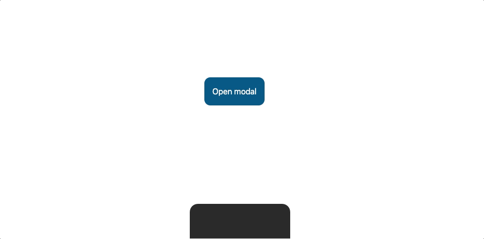
Here's how our component looks in the browser:
Awesome, now we have one last thing to take care of in regard to focus management.
According to the ARIA APG: "Modal dialogs contain their tab sequence. That is, Tab and Shift + Tab do not move focus outside the dialog".
So let's get right into it.
One way to implement this is to insert a focusable element before our modal element and another one after.
When the element before our modal element receives focus, it should move the focus to the last focusable descendant in our modal.
When the element after our modal receives focus, it should move the focus to the first focusable descendant in our modal, hence focus stays within our modal.
// useModal.js

//...unchanged code hidden for brevity
export function useModal({ focusOnOpenRef, focusOnCloseRef } = {}) {
  //..
  useEffect(() => {
    // keep focus within modal until closed
    const { current: modalNode } = modalRef;
    const modalParent = modalNode ? modalNode.parentNode : null;
    const pre = document.createElement("div");
    const post = document.createElement("div");
    pre.tabIndex = 0;
    post.tabIndex = 0;

    if (modalNode) {
      pre.addEventListener("focus", () => {
        focusLastDescendant(modalNode);
      });
      post.addEventListener("focus", () => {
        focusFirstDescendant(modalNode);
      });
      modalParent.insertBefore(pre, modalNode);
      modalParent.appendChild(post);
    }

    return () => {
      if (modalParent) {
        modalParent.removeChild(pre);
        modalParent.removeChild(post);
      }
    };
  },[isOpen]);
}

const focusLastDescendant = (element) => {
  for (let i = element.childNodes.length - 1; i >= 0; i--) {
    let child = element.childNodes[i];
    if (attemptFocus(child) || focusLastDescendant(child)) {
      return true;
    }
  }
  return false;
};

//...
Ok, so we've created another effect that does just what we discussed before, return a clean-up function that removes the inserted elements when our modal closes.
We've also added the function focusLastDescendant that does what the name implies.
Here's how our component looks in the browser:
Keyboard interaction
This is a pretty straightforward one, we just need to close our modal when we hit the Escape key.
// useModal.js

//...
  const getModalProps = () => {
    const modalClickHandler = (event) => {
      event.stopPropagation();
    };
    //new handler
    const modalKeyDownHandler = (event) => {
      if (event.which === 27) {
        closeModal();
      }
    };

    return {
      role: "dialog",
      ref: modalRef,
      "aria-labelledby": labelId,
      "aria-modal": true,
      onClick: modalClickHandler,
      onKeyDown: modalKeyDownHandler,
    };
  };
//...
All we've done is that we've added a new handler modalKeyDownHandler and passed it as the value of the new onKeyDown property to the object returned by getModalProps.
Conclusion
So now we have a very powerful custom hook that provides a lot of flexibility in building modal components, here's a working sandbox.
There are still a few ways to improve our useModal hook, things like blocking the scrolling of the page when the modal opens, and allowing users to hook onto state changes and pass in custom logic (I will be writing an article about this soon)
I hope you enjoyed reading this article and perhaps learned a thing or two. If you have any questions or thoughts please share them in a comment.
Cheers